Dark mode

In-App Landing Page

Hiring clients land somewhere that actually orients them — so the first thing they see isn't a blank slate, it's a clear starting point for the work they came to do.
Role Product Designer Company ISN Shipped
Stack
Figma
Stakeholder collaboration
User research
Problem
When hiring clients logged in, they arrived at an experience that offered no orientation — no summary of what needed attention, no shortcuts to their most common tasks. Users had to know where to go before they could get anything done, which created friction right at the moment when confidence should be highest.
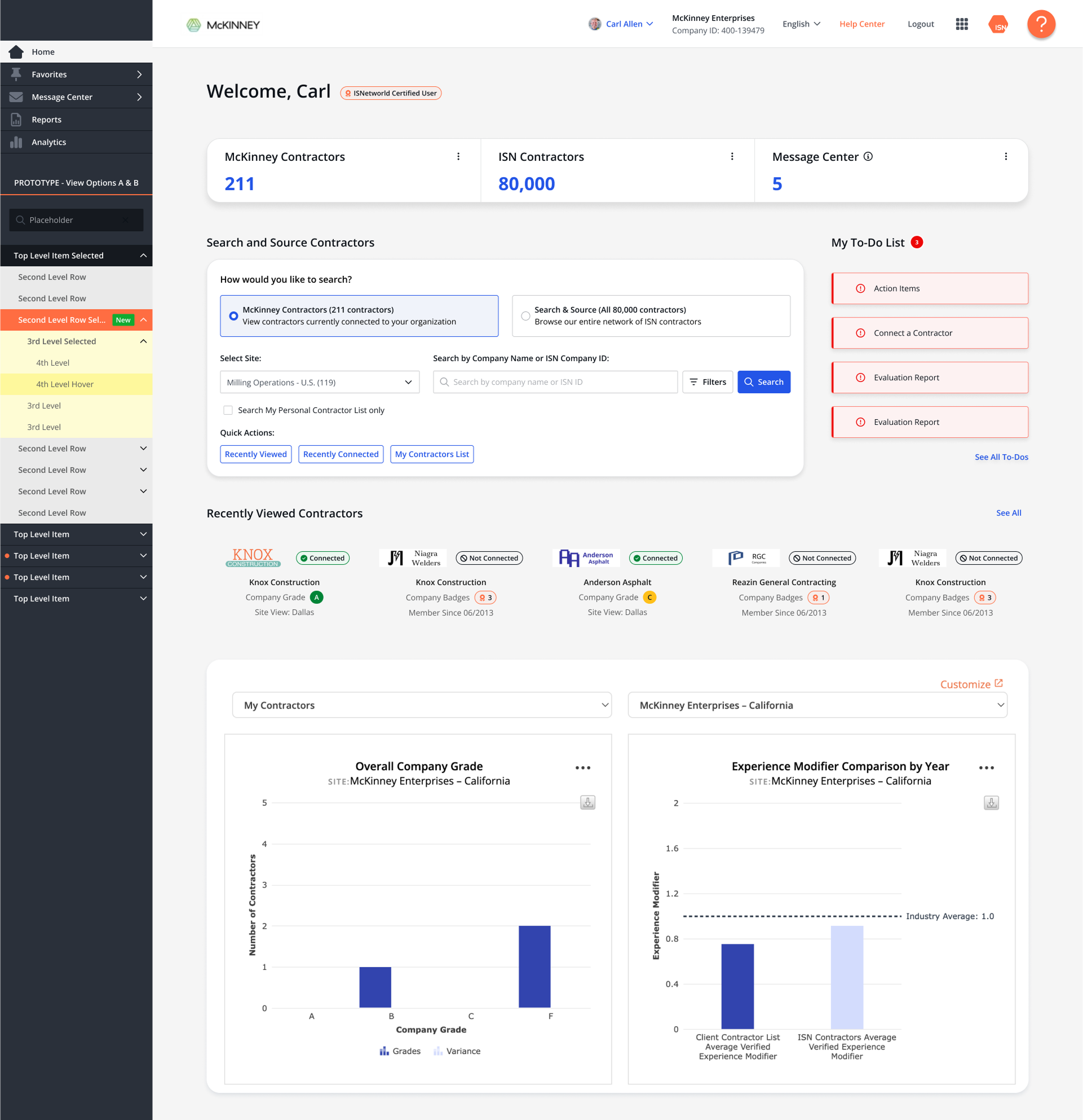
Intervention
Designed a personalized welcome landing page that surfaces the most relevant actions and status information immediately on login. The standard search experience was preserved while adding contextual entry points that route users directly into the workflows they arrive to complete.
Outcome
Users land with a clearer sense of where they are and what needs to happen next. Orientation friction drops, time-to-first-action improves, and the platform starts feeling like a tool that knows how you work — not one you have to navigate before you can use it.
Impact
Immediate context
Users arrive oriented — relevant status and actions on first load
Faster starts
Direct entry points reduce time from login to first productive action
Familiar search
Standard search preserved — new surface adds to the experience, not over it
Design artifacts are protected
Screenshots and design files for this project are kept confidential out of respect for the client. If you'd like to review them as part of a hiring or collaboration conversation, reach out directly.
01 / Research
Research
Reviewed session data and support patterns to understand what hiring clients were doing immediately after login — and how long it was taking them to get there. The answer was consistent: too many clicks to reach the work, and no clear signal about what needed attention.
02 / Define
Define
Defined the landing experience around two jobs: orient the user and surface the path to their next action. Explored multiple concepts before landing on a welcome surface that complemented the existing standard search rather than replacing it.
03 / The hard call
The hard call
The temptation was to personalize everything — role-based modules, configurable widgets, full dashboard logic. The harder and better call was to keep it focused. A landing page that tries to do everything ends up orienting no one.
"Purposeful simplicity over configurable complexity — orientation is a single job"
04 / Ship & Watch
Ship & Watch
Shipped and tracked engagement with the entry points and search behavior. The goal was not just adoption but reduction in the number of steps users took before reaching their primary task.
Next: Publish Trainings →